Diamonds
Main Actions
Actions
Explore the gradient in different formats, and actions.
Colors overview
| Color | HEX | RGB | HWB | OKLAB | OKLCH | P3 | Actions |
|---|---|---|---|---|---|---|---|
| | #78b0e7 | rgb(47.1% 69% 90.6%) | hwb(210 47% 9.4%) | oklab(74% -0.036 -0.093) | oklch(74% 0.099 249) | color(display-p3 0.518 0.684 0.887) | |
| | #90c1f0 | rgb(56.5% 75.7% 94.1%) | hwb(210 56% 5.9%) | oklab(79.4% -0.032 -0.079) | oklch(79.4% 0.085 248) | color(display-p3 0.605 0.751 0.925) | |
| | #a9d1f9 | rgb(66.3% 82% 97.6%) | hwb(210 66% 2.4%) | oklab(84.6% -0.026 -0.066) | oklch(84.6% 0.07 249) | color(display-p3 0.694 0.815 0.962) |
Click on a color value to copy it to your clipboard.
Contrast ratios checker
Click one color card to view the complete contrast checker tests.
#78B0E7
Fail - 2.29
#90C1F0
Fail - 1.89
#A9D1F9
Fail - 1.59
Contrast Level Explanations
Click on a color block to open the full contrast checker. Levels are based on WCAG 2.1 guidelines.
AAA
Easy to read for everyone, including people with visual impairments.
AA
Meets standard requirements for most users and situations.
Fail
Text may be difficult to read, especially for people with visual challenges.
Color blindness
The simulation of color blindness may not be 100% accurate sometimes.
Colors preview as gradient with Protanopia
Colors preview as palette with Protanopia
UI components preview
Preview the gradient in different UI components.
Love your coffee as much as we do?
Buy now

Colorffy
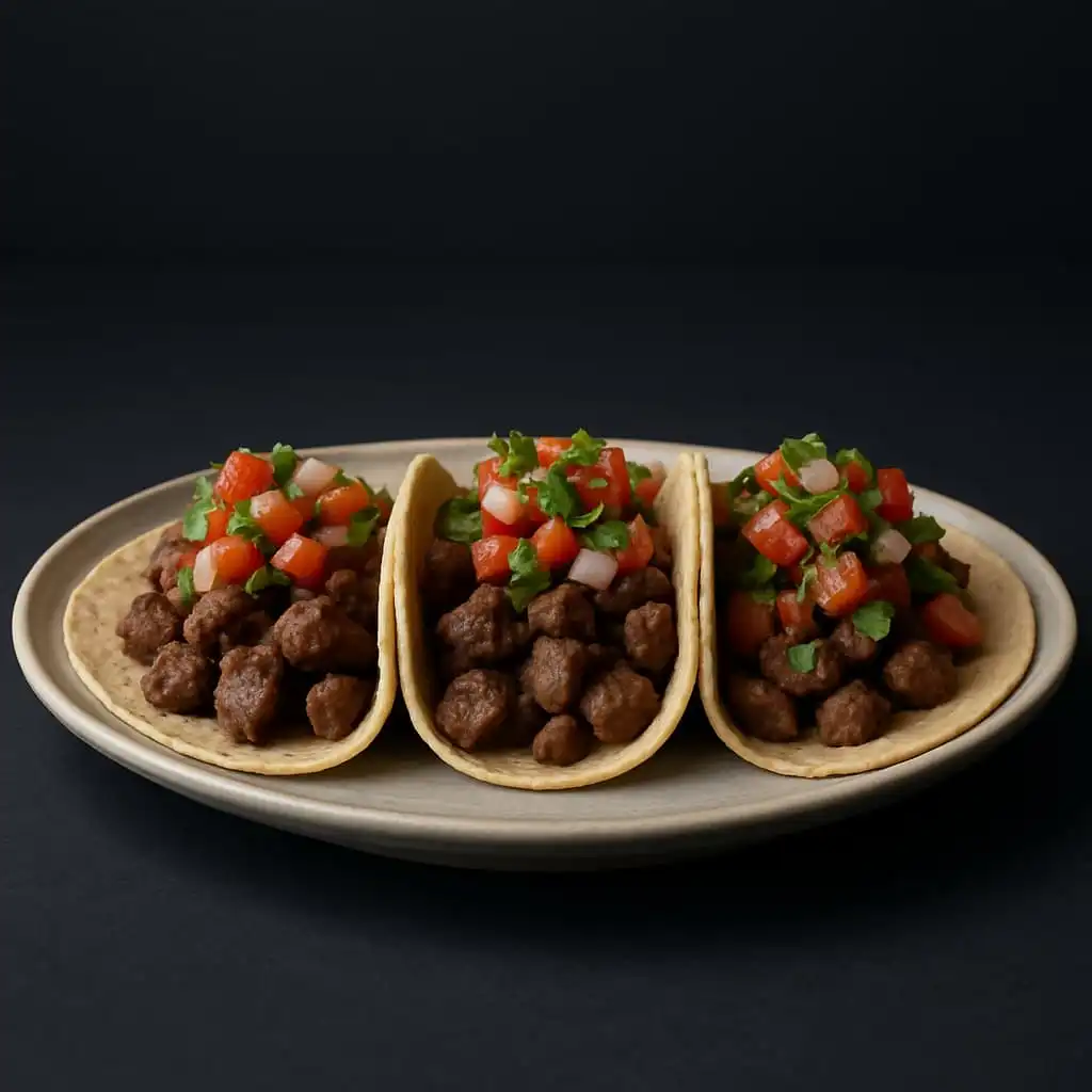
Love your taco as much as we do?
Shop now
